Triple 6 Burgers
Brief:
Design a brand identity for an up and coming, hell-themed, spicy burger food truck.
Include:
Logo (primary, secondary, brandmark)
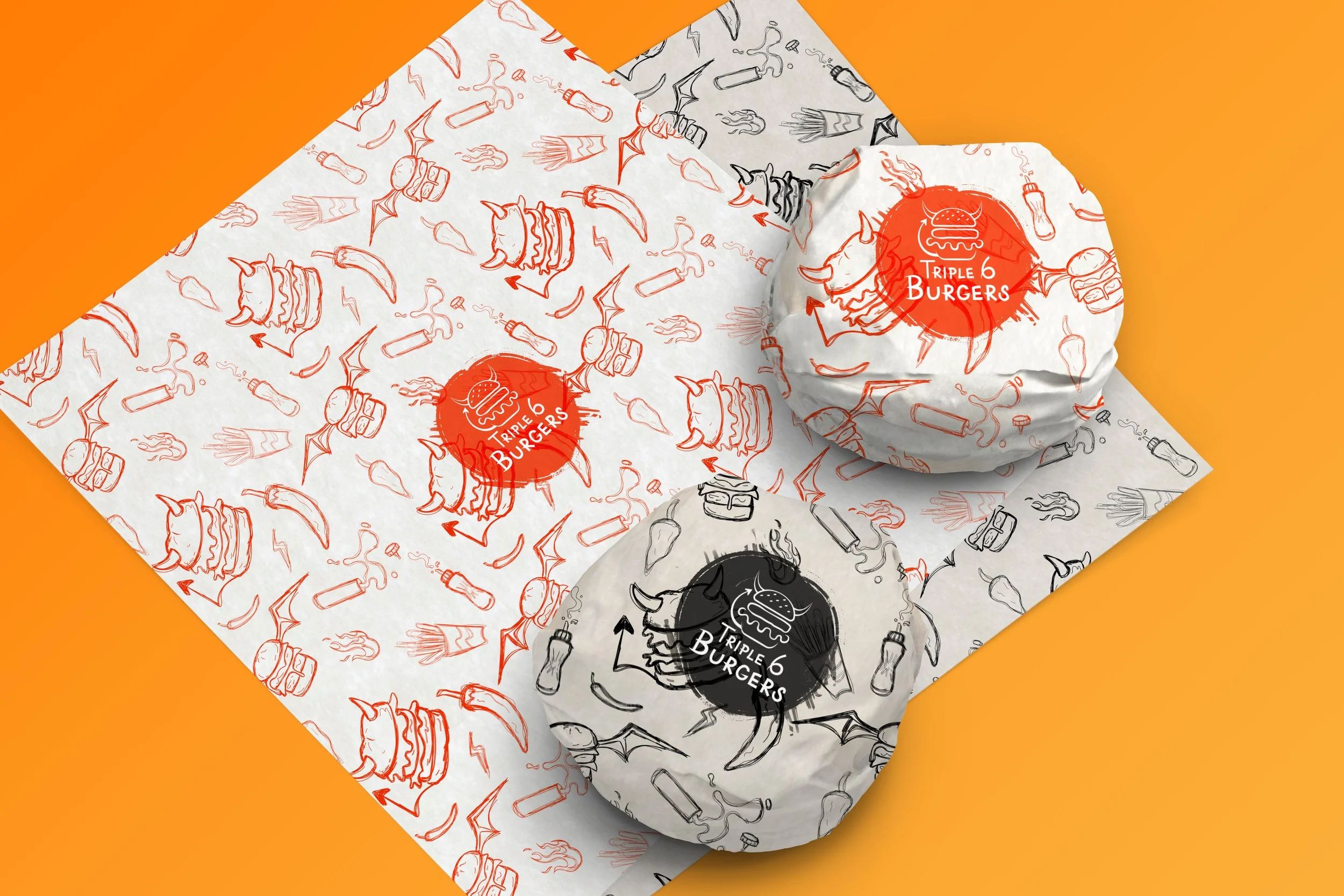
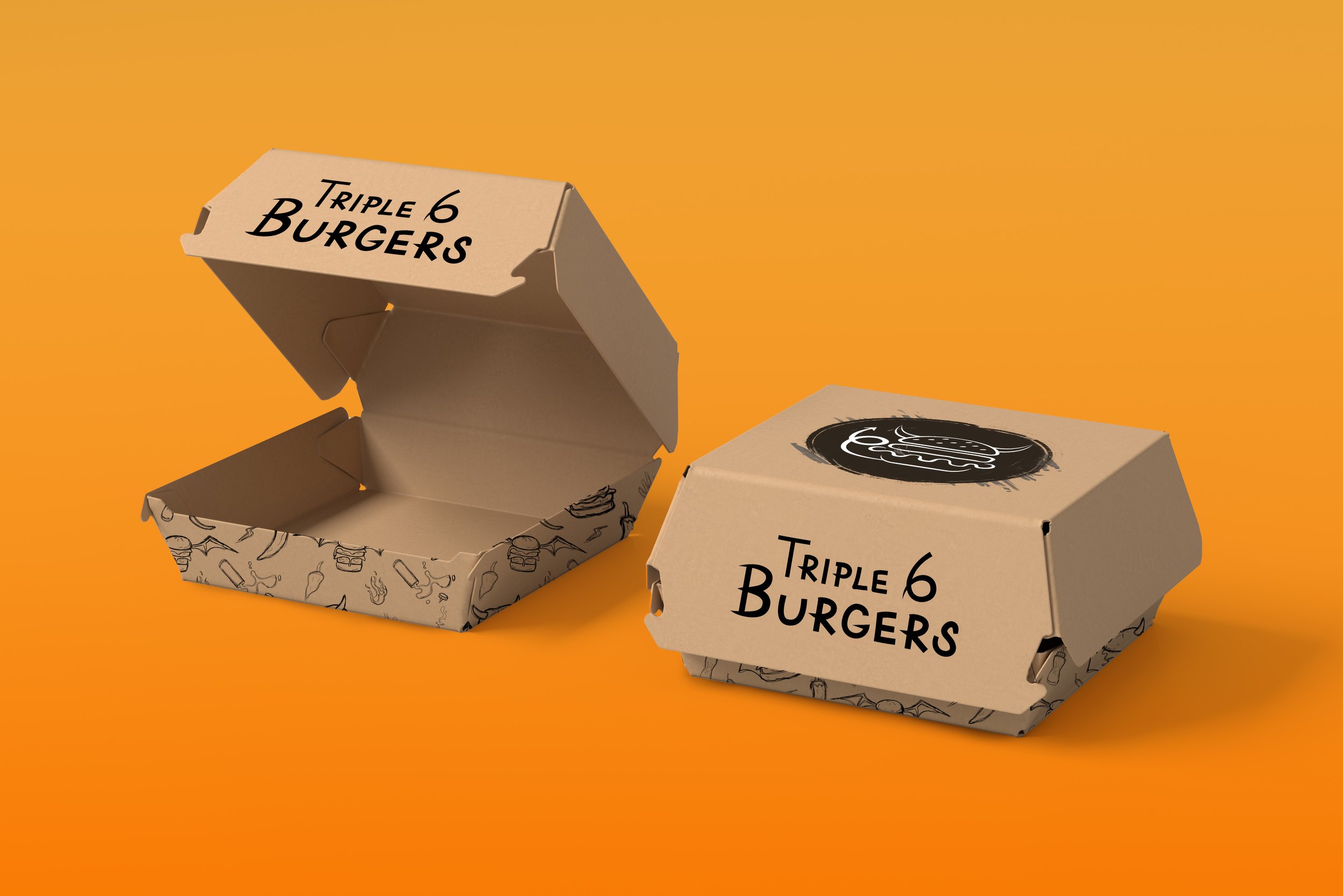
Packaging mock ups
Food truck mock up
Menu design and mock up
Patterns
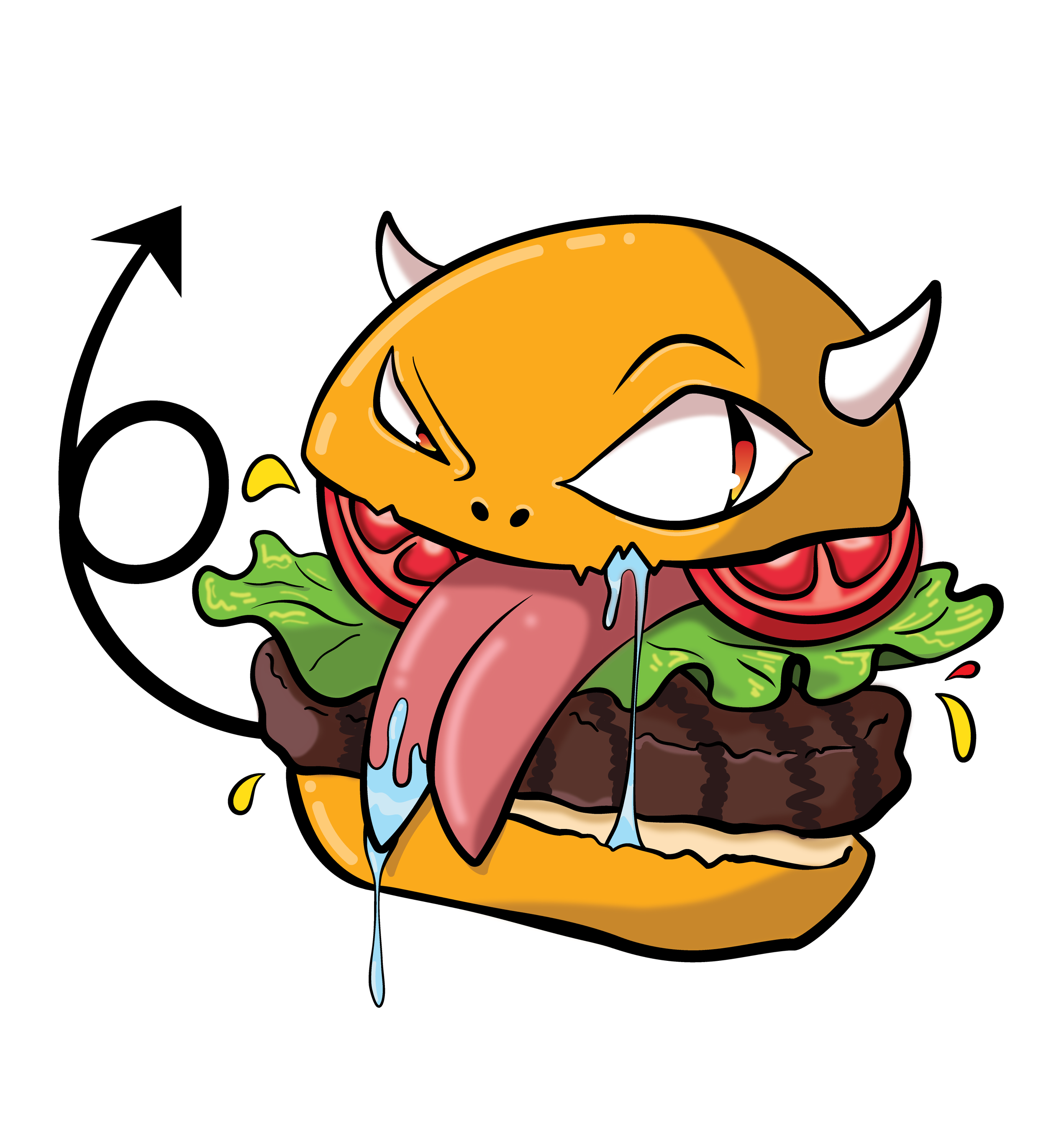
Mascot Illustration
Brand Board
Process Breakdown

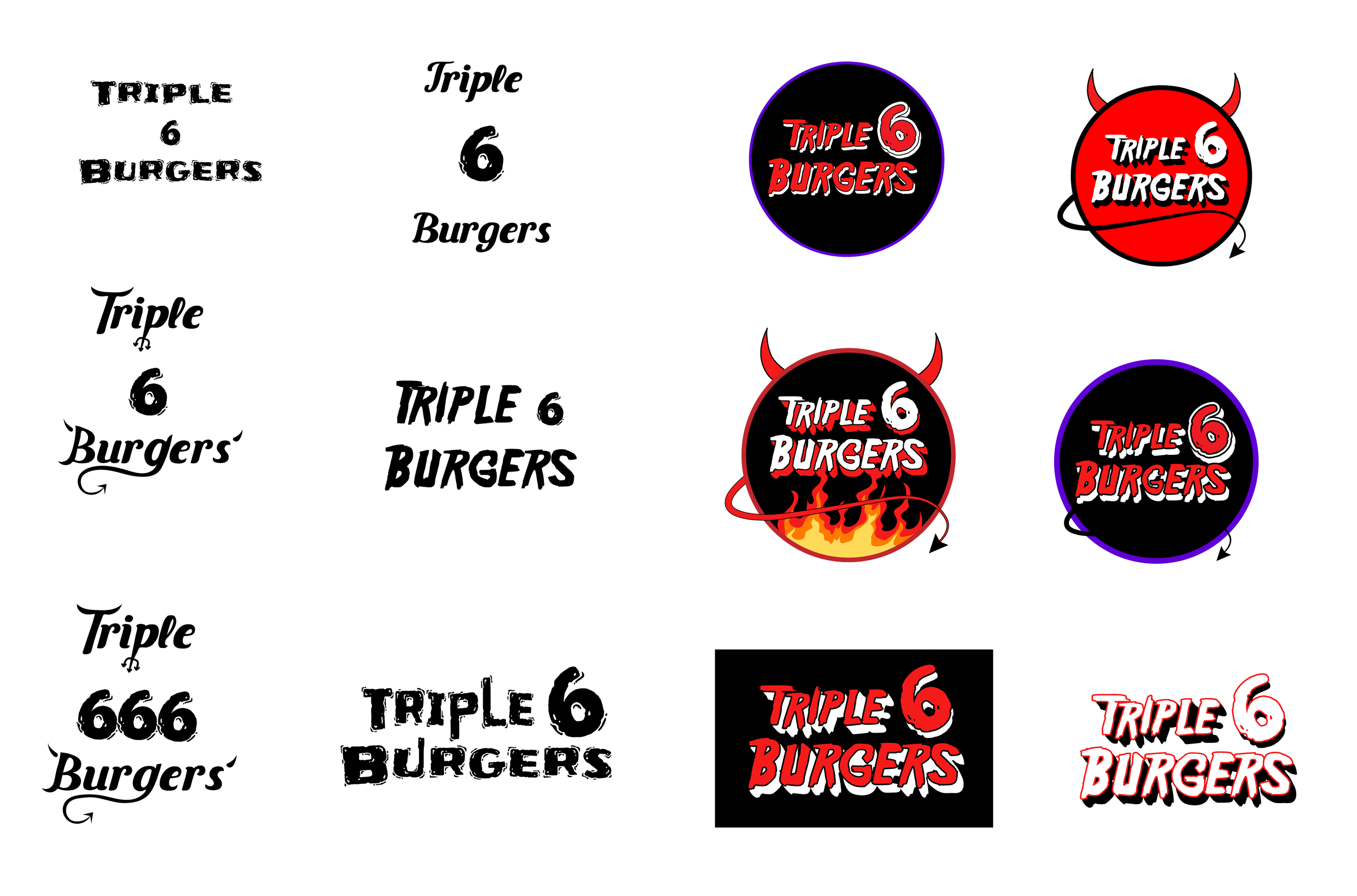
Logo evolution
Some of the older logo iterations I explored to test out specific type faces that captured the theme of the food truck. The most problematic aspect of some of these are the lack of contrast which makes it a little taxing to read the business name. Some of them had busy compositions and took attention away from the name. It was also brought to my attention that most successful logos work in a single color, and the right two columns were not done well
Primary Logo
Secondary Logo
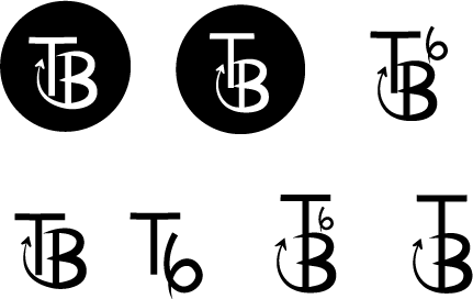
Working brandmarks
Initial sketches utilizing the initials of the business, but it wasn’t quite as cohesive as using the burger icon from the previous two logo designs and adjusting the tail to playfully represent a six.
Final Brandmark
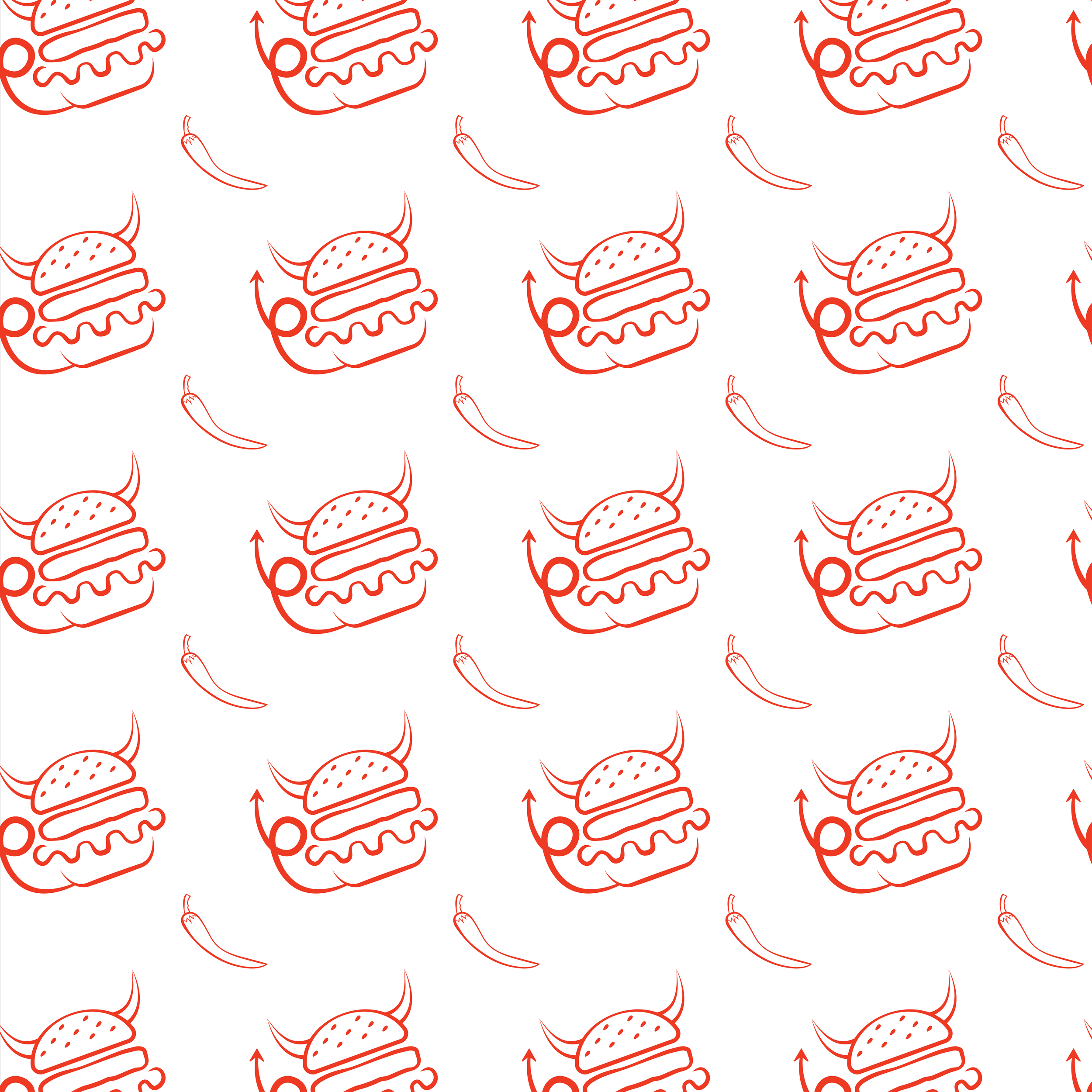
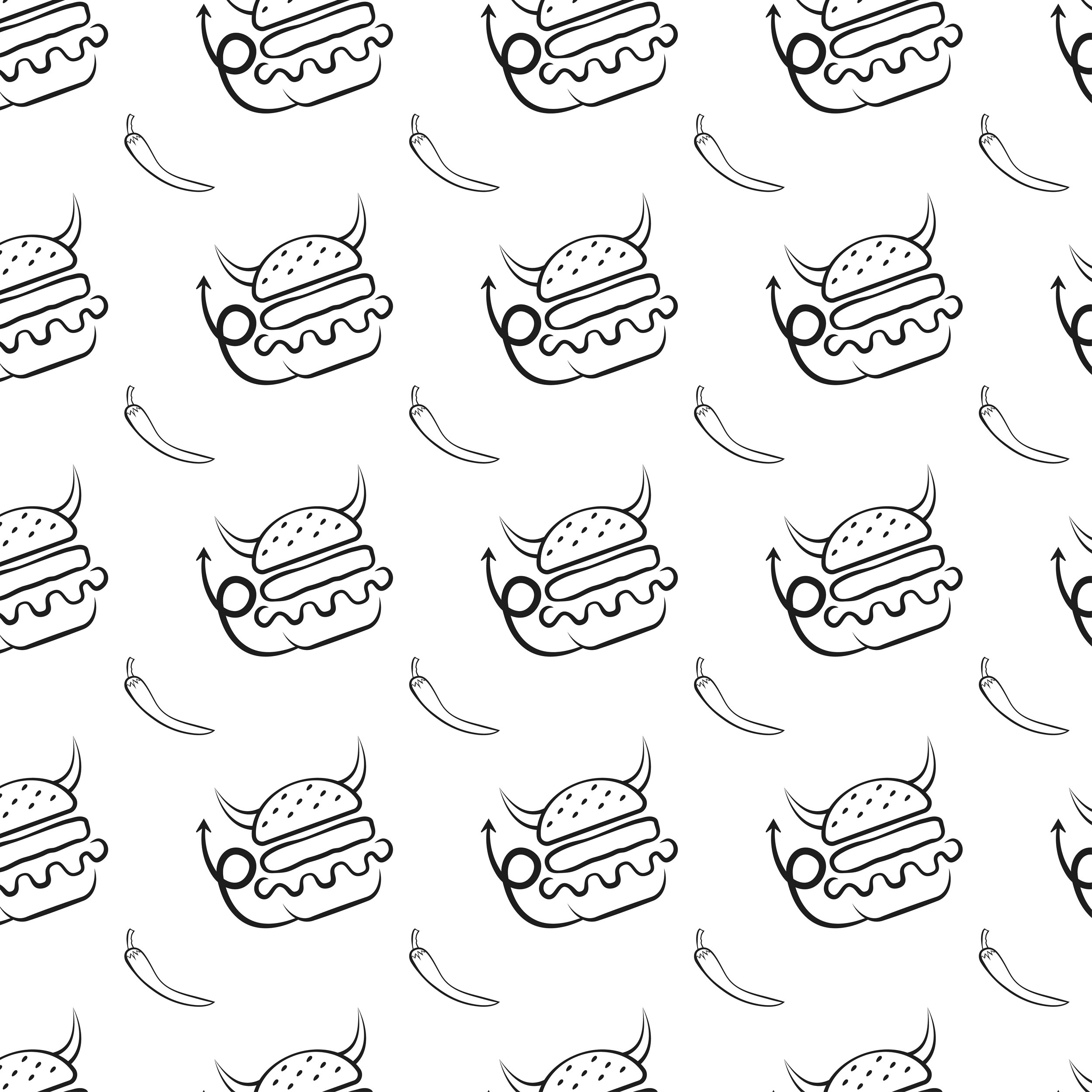
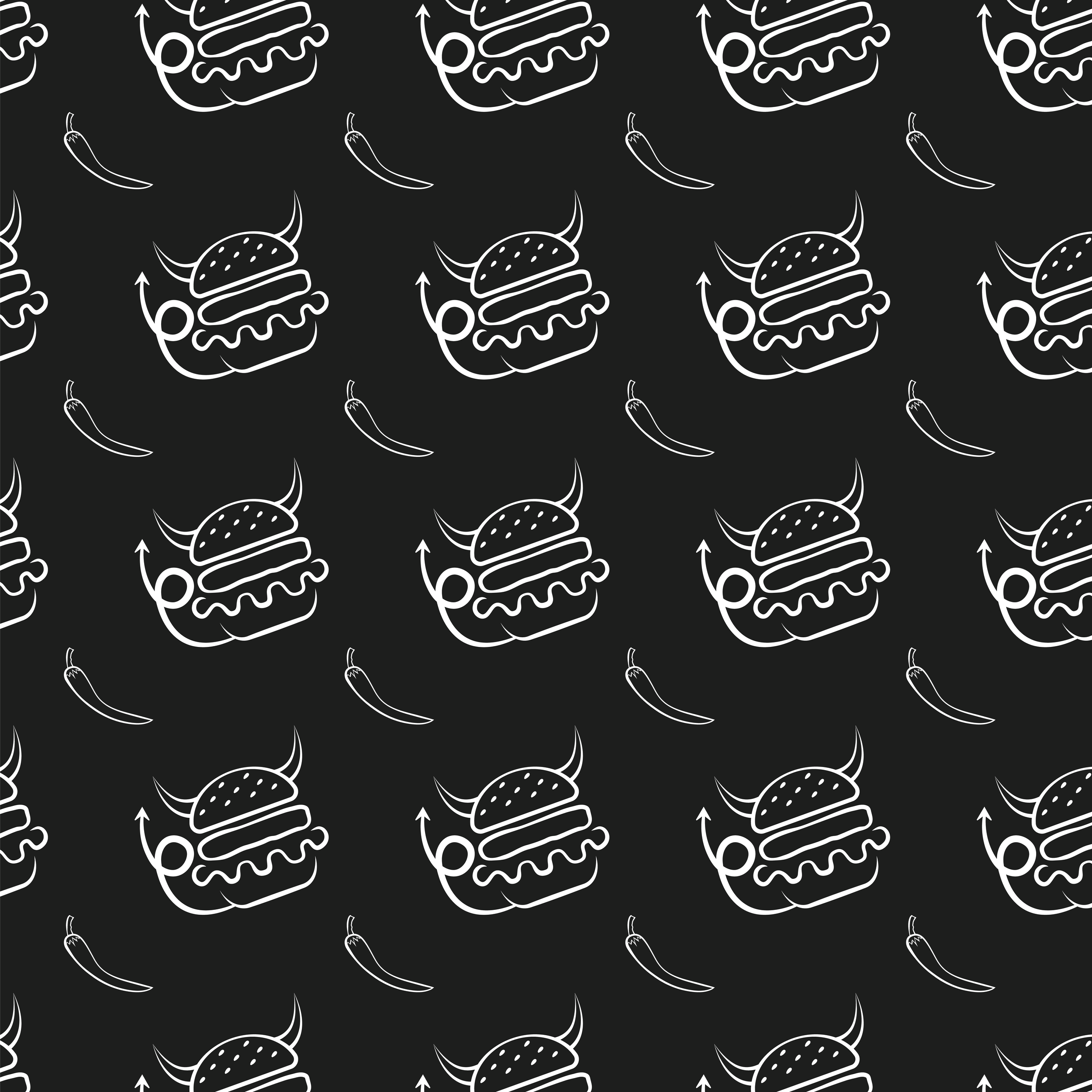
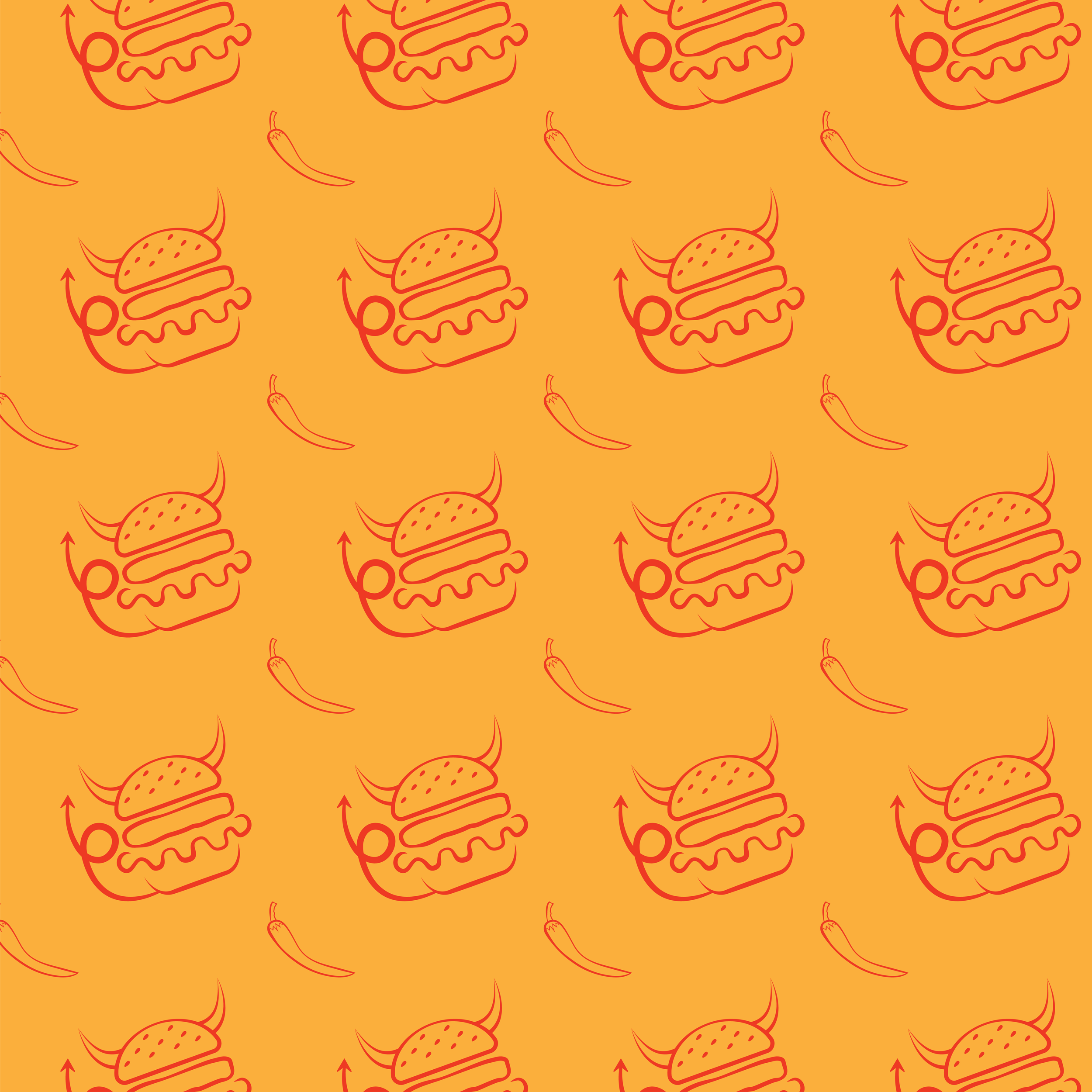
Pattern 1: Brandmark
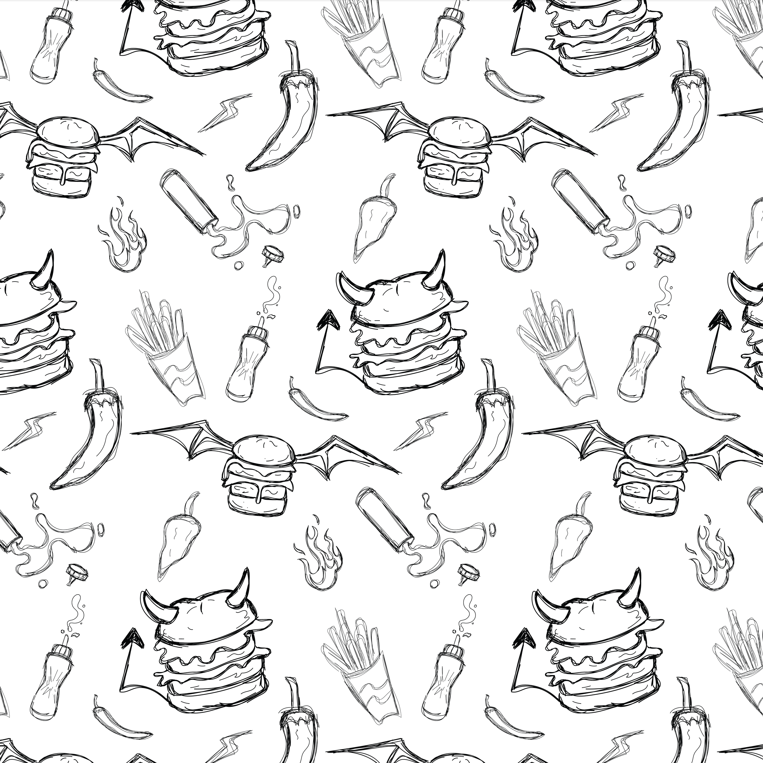
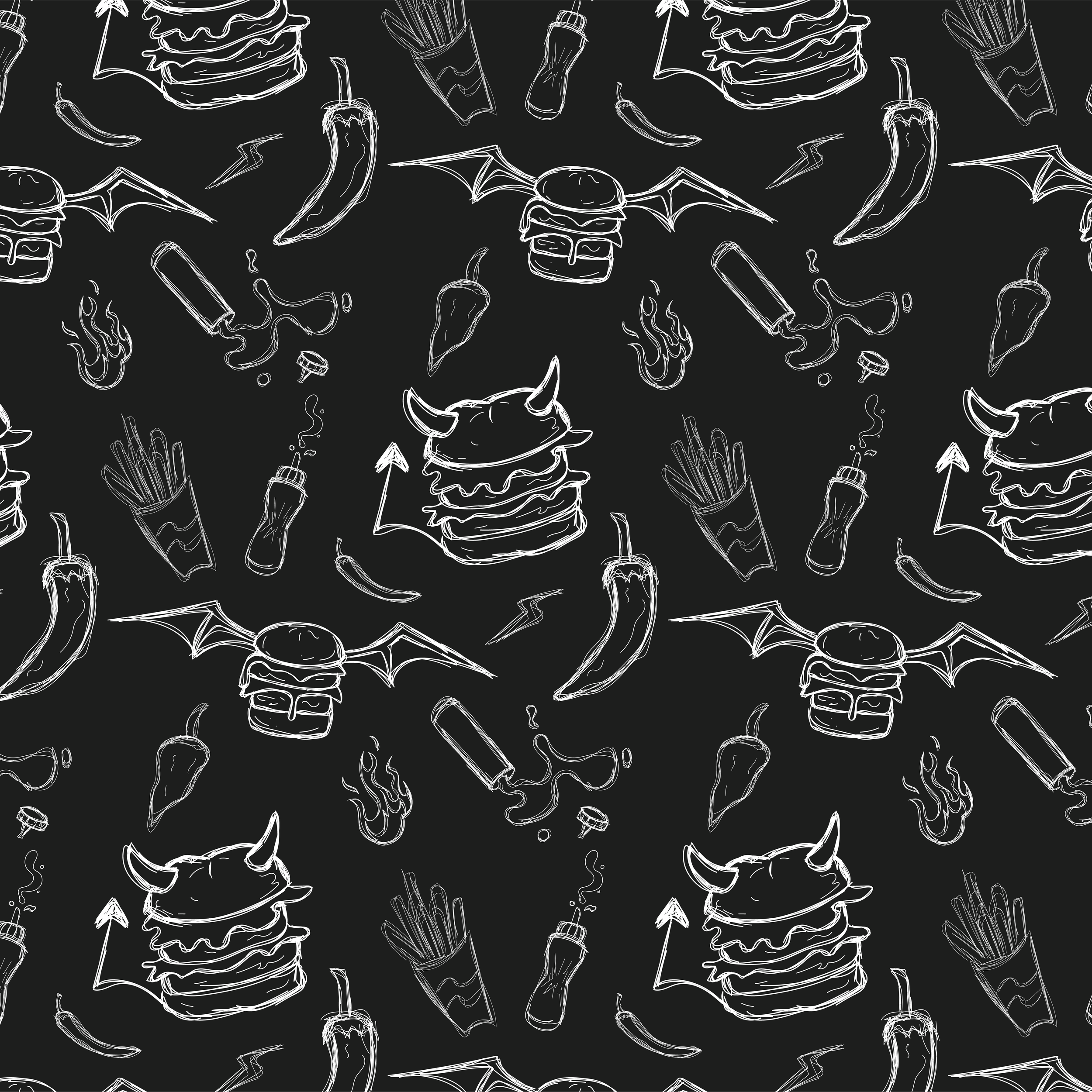
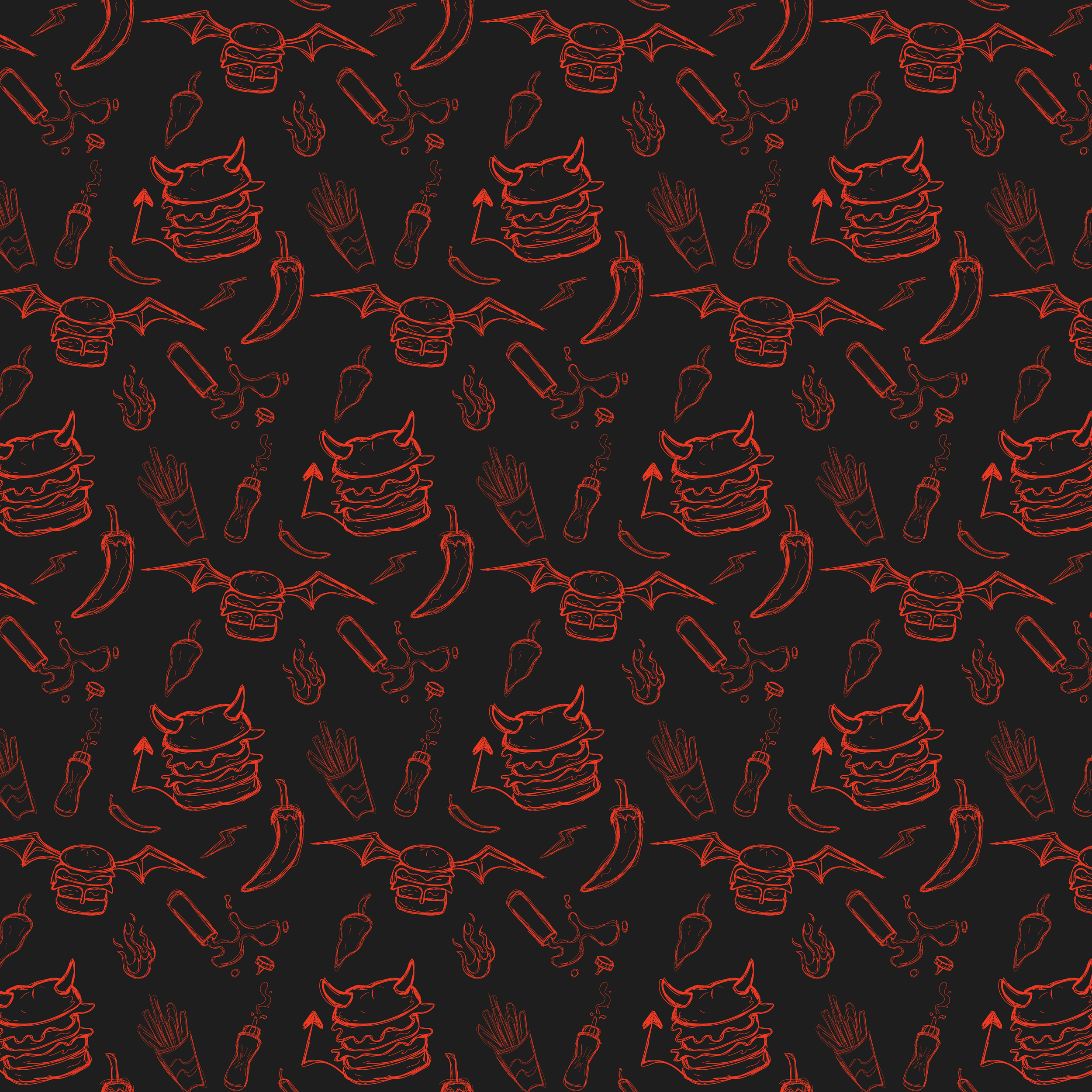
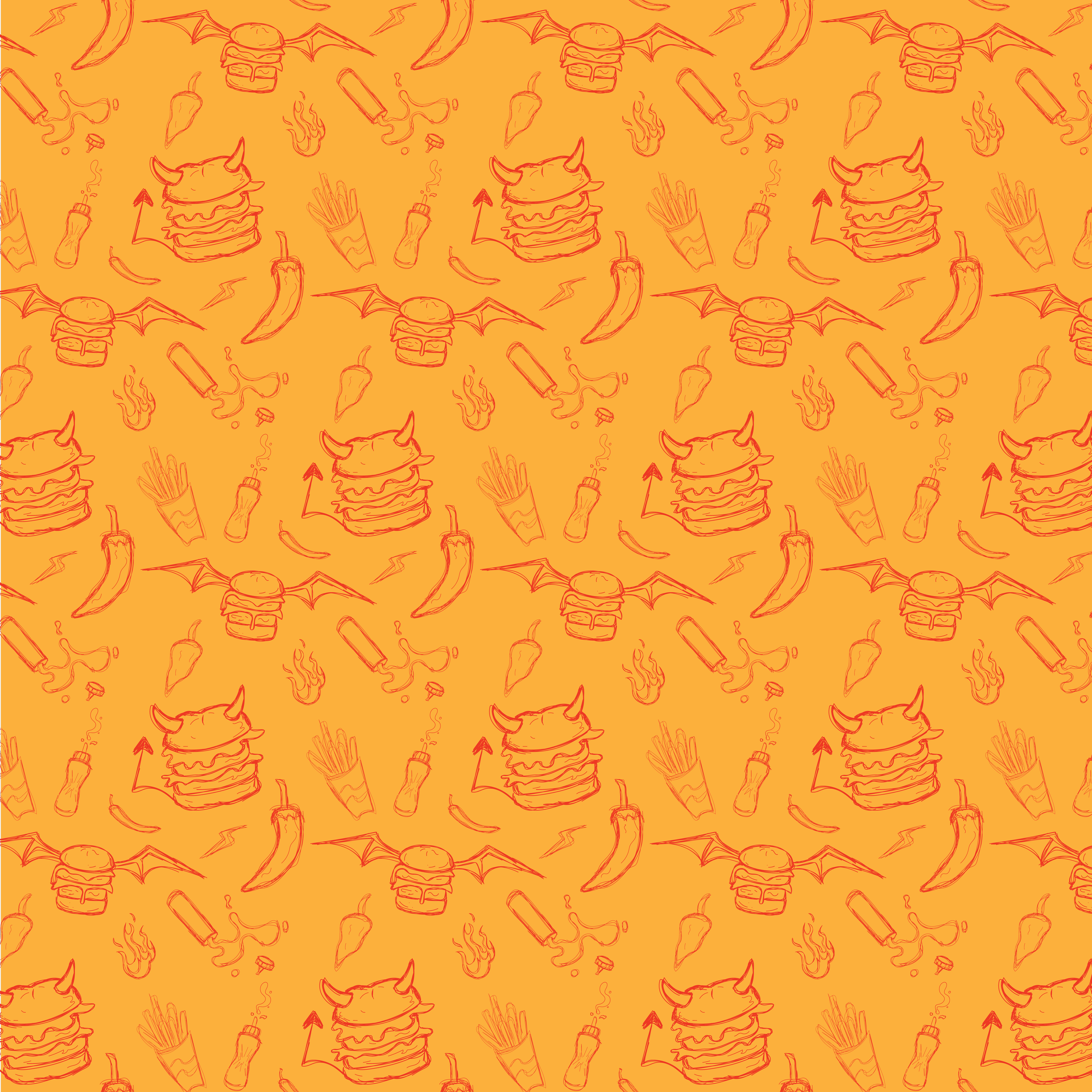

Pattern 2: Meant to capture the theme/vibe of the brand
The Menu
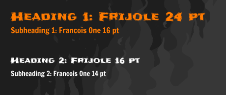
Menu Style Guide
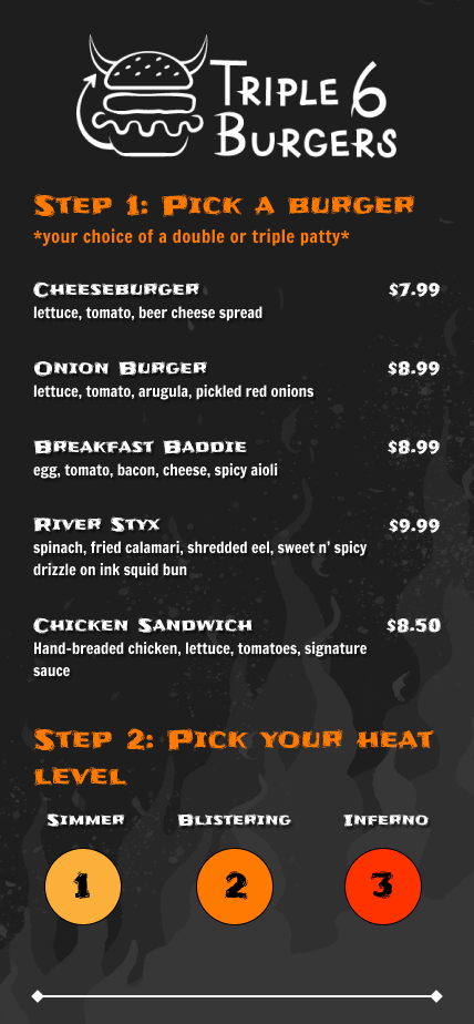
Front
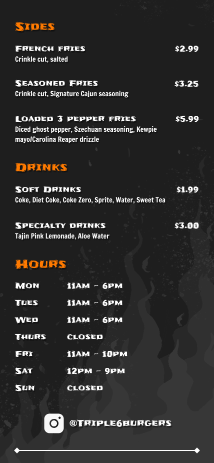
Back
Food Truck
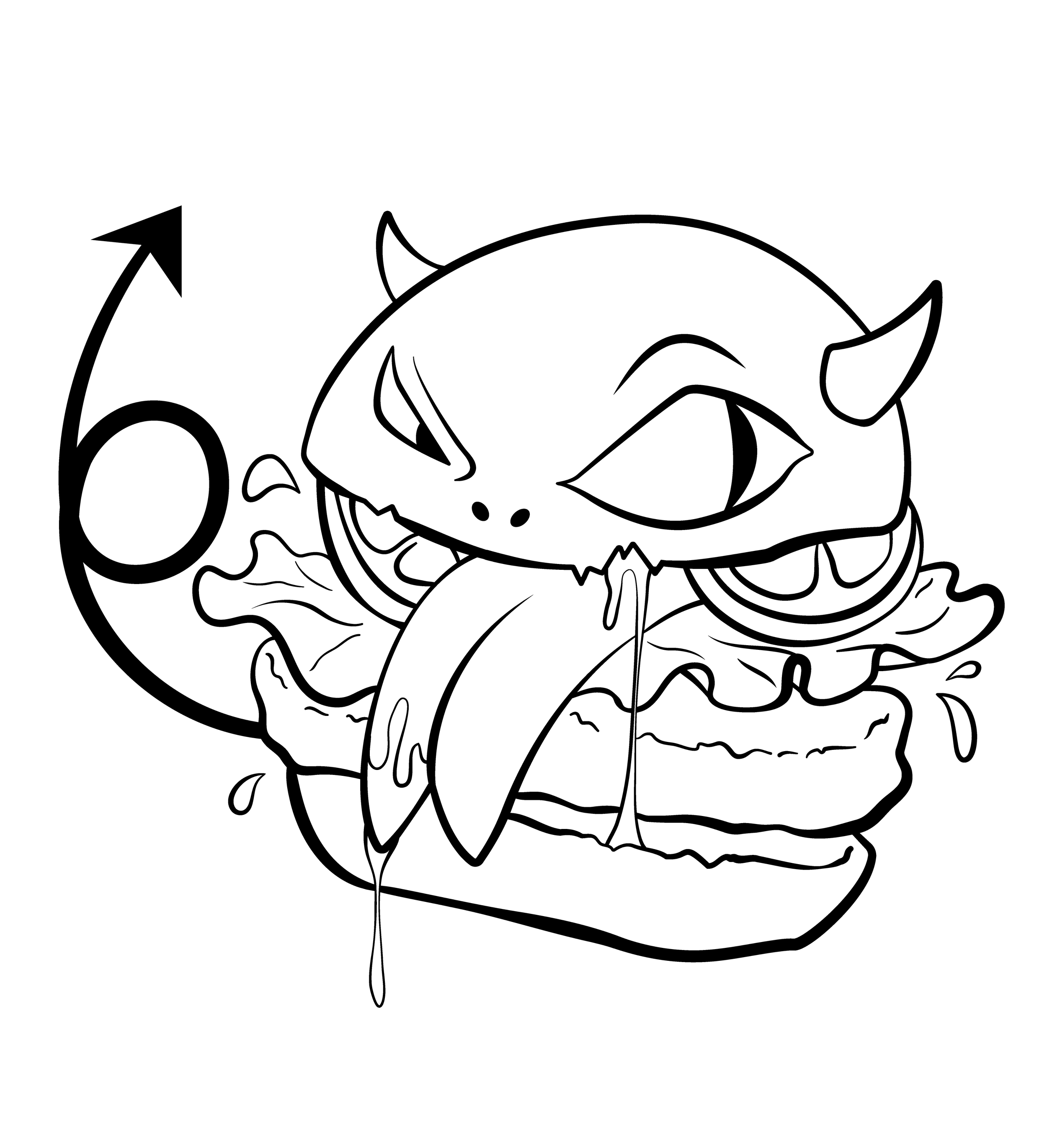
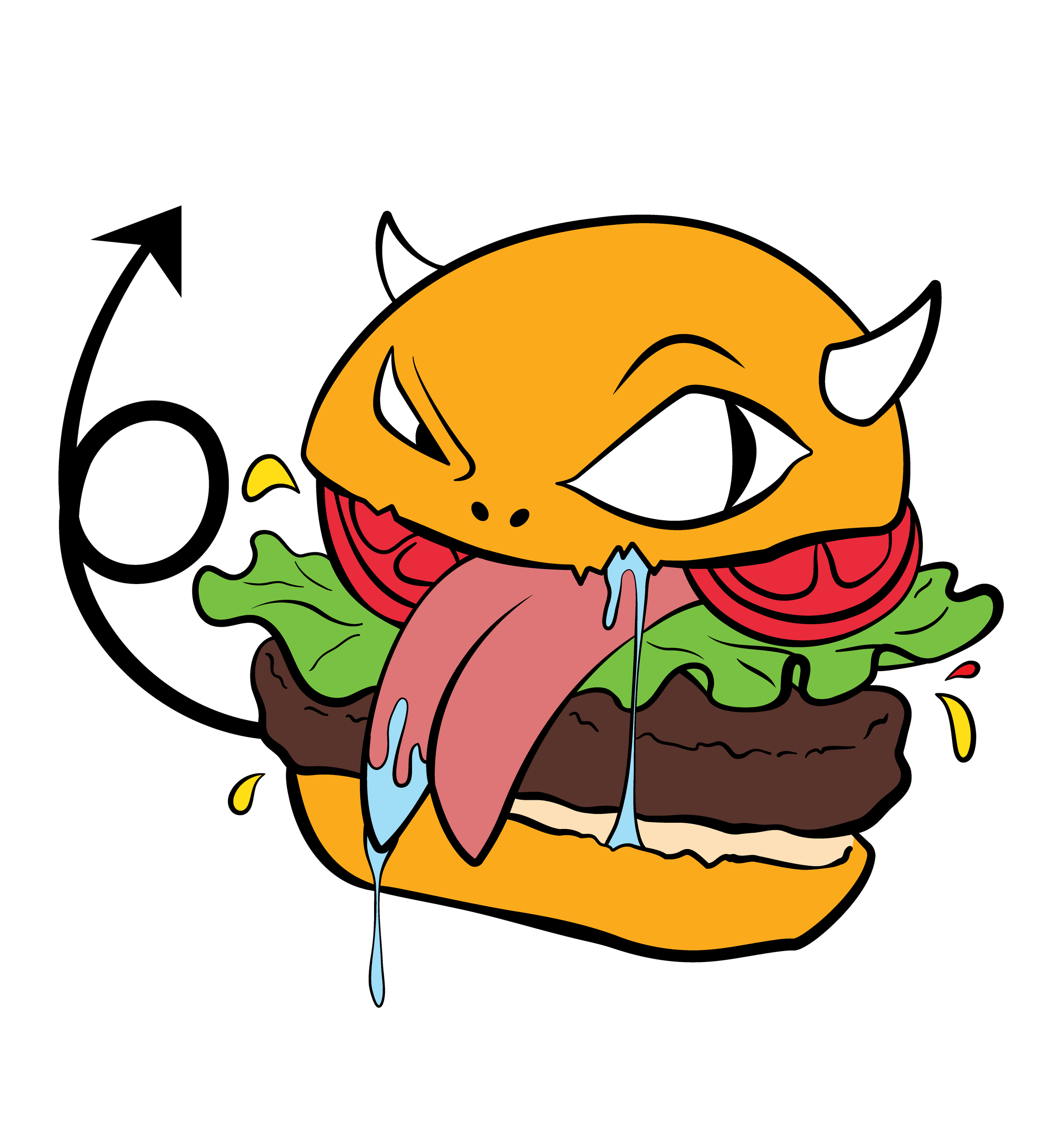
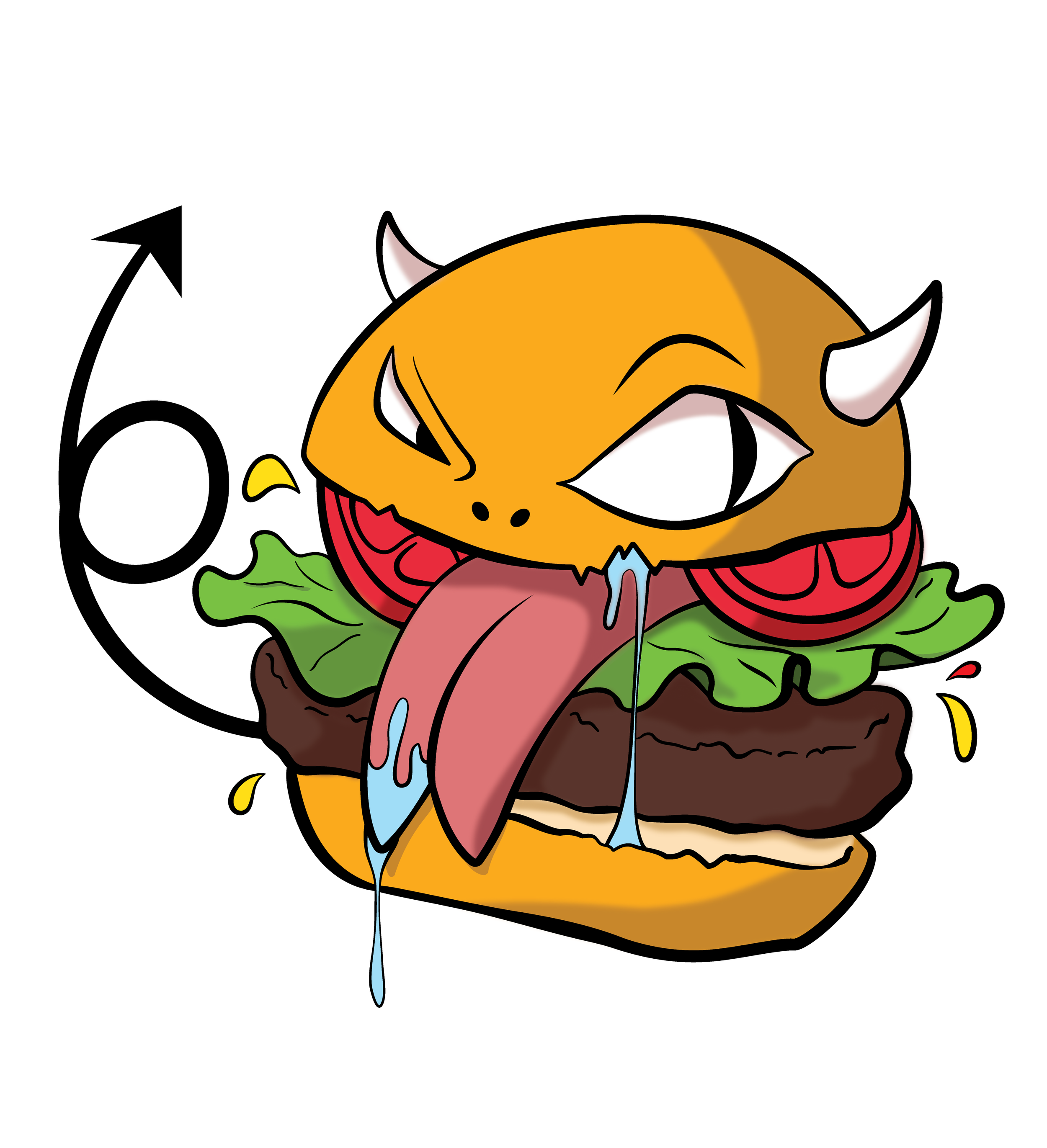

When designing the food truck, I wanted to go beyond just simple blocks of color with the occasional pattern element to break the composition. And so the devilish burger was born! Thinking about the truck driving around, I imagined that an imposing illustration slapped on the side of it would turn some heads and pique curiosities.
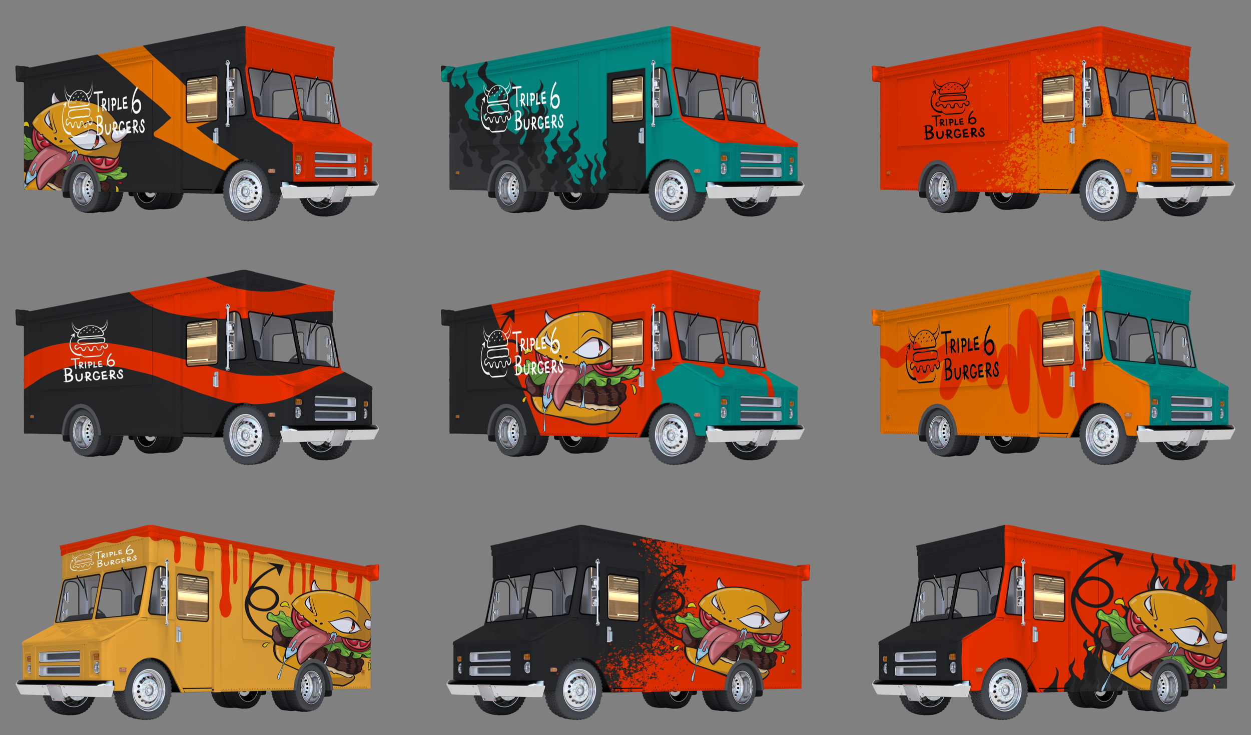
Rough color layout
Thumbnail sketches to test out some color contrast and composition for the final food truck. This was back when I had included aqua blue as part of the original color palette.
Final Truck Design
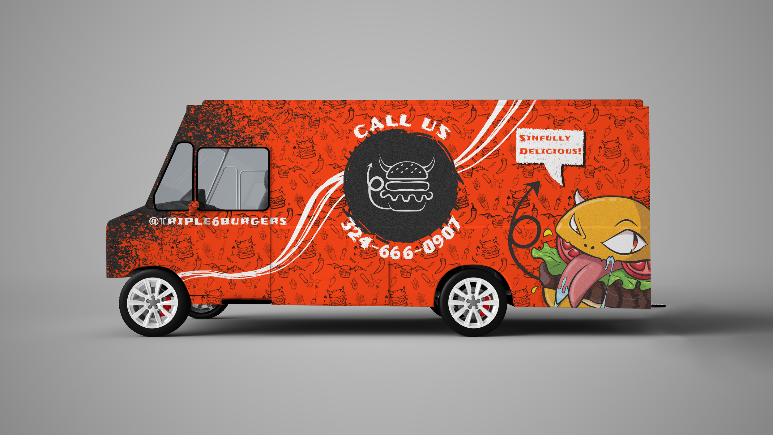
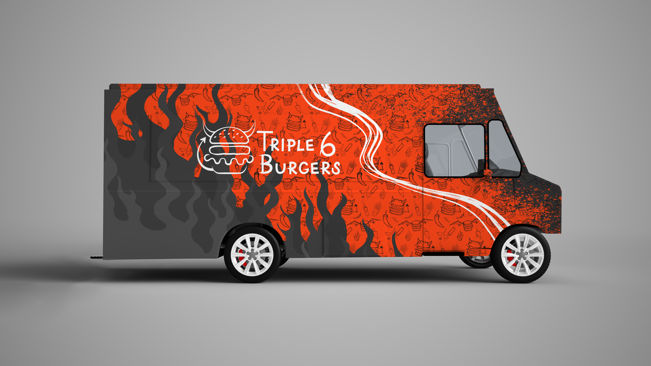
For the final design, I did combine aspects of a few thumbnails and added other elements that were used throughout the design process.
Final Thoughts
This was a very challenging project. It was my first attempt at developing a brand identity and creating various assets for it.
Summary of what I learned:
Make a decision and commit to it despite the temptation of possibilities.
Less really is more (but more can be fun).
Don’t get so attached to any one design, if it needs to change LET IT.